Market Profile: How I Read TPO Charts
Every level I trade against starts on a TPO chart. This is the full guide: how the profile builds, value area and POC, naked POCs, the profile types, and how it all fits into an actual trading day.

If you watched me prepare for a session, most of what I mark on the chart comes from market profile. Yesterday's value area, the point of control, any naked POCs left above or below. Then during the session I use order flow to decide what to do when price gets there.
So this guide is the location half of my process: how TPO charts work, what the shapes mean, and how I use the levels in a normal trading day.
What Market Profile Actually Is
Market profile comes out of the Chicago trading pits. Peter Steidlmayer built it at the CBOT in the 1980s as a way to organize the day's trade around one idea: the market is an auction, and the auction's job is to find the price where business gets done. Some prices attract trade and hold it. Others get rejected in minutes.
A candlestick chart shows that journey in order, while a profile shows the result: how much time the market accepted each price. And acceptance versus rejection is most of what I care about as a day trader, so a chart built entirely around showing me that is obviously going to earn its screen space.
TPO stands for Time Price Opportunity, and it works like this.
How a TPO Chart Builds
The session gets split into 30-minute periods, and each period gets a letter. In US futures the first period of the cash session is A (9:30-10:00 ET), the second is B, and so on. Every price a period touches gets marked with that period's letter. Then all the columns collapse into one stack.
That's the entire mechanic, there's no indicator math hiding underneath. A fat profile row means the market kept coming back to that price. A row with one lonely letter means price passed through and nobody wanted to do business there.
The first hour (periods A and B) has its own name, the initial balance. It matters because the first hour is when the overnight positions and the opening orders fight it out, and how the rest of the day treats that range tells you a lot about who won.
The Anatomy: POC, Value Area, Tails and Single Prints
The POC (point of control) is the longest row, the price where the market spent the most time. Think of it as the session's fairest price: the level both sides accepted longest. Price tends to rotate around it on balanced days, and old ones keep mattering long after the session ends.
The value area is the band around the POC holding roughly 70% of the session's letters. Its edges, VAH above and VAL below, are two of the most useful reference prices in day trading. Inside value, the market agrees on price, so trade chops back and forth. At the edges, someone is making a decision, and that's where I want to be paying attention.
Tails (or excess) are the thin single-letter strings at the profile's extremes. A long tail at the low means sellers pushed price down and got slammed by buyers within one period. That's rejection, and it's strength. A clean tail is the auction saying "not here."
Single prints inside the body of the profile mark places price moved through so fast that only one period touched them. Fast moves mean emotion and imbalance, and the market has a habit of coming back later to trade those areas properly. I treat single prints as open business. If you've come across fair value gaps, that's the same idea drawn on a candlestick chart, and I break down the comparison in fair value gap explained.
Poor highs and poor lows are the opposite of tails: a flat extreme where two or more periods stopped at the same tick. No excess, no real rejection, just a pause. The market often revisits and repairs them.
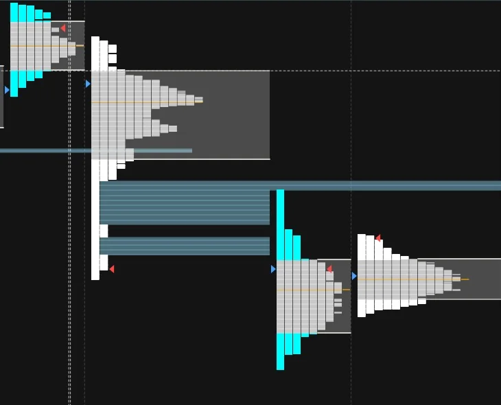
The Profile Types
Every session prints a shape, and the shape tells you what kind of auction happened. There are formal names for a dozen variations, but these six cover what you'll actually see and use.
Normal / balanced day
A fat symmetric bell. The market found fair value early and rotated around it all day. Fade the edges, respect the POC, don't expect breakouts to stick.
Trend day
Long and thin, value moving in one direction all session. Fading these is how profile traders get hurt. One-timeframing (each period making new extremes) is your warning.
Double distribution
Two balance areas connected by single prints. Usually news hit mid-session and the market repriced. The single-print bridge becomes a key reference: acceptance back inside it changes the day.
P-shape
Rally, then balance up top. Classic short covering: aggressive buying that stops making progress. If new buyers don't show up after the squeeze, the bulge is where they're trapped.
b-shape
Sell-off, then balance at the lows. Usually long liquidation: trapped longs giving up. Once the selling exhausts, watch how the market treats the bulge's POC.
Neutral day
Price probed beyond the initial balance in both directions and came back. Neither side could finish the job. Where it closes relative to the middle decides who goes home nervous.
Don't treat the shapes as trade signals on their own, they're context. A P-shape after a long rally reads very differently than a P-shape at the bottom of a two-week decline. The profile tells you what the auction did, and you still have to ask why, and what everyone who did it is now stuck holding.
Naked POCs: The Levels That Keep Working
When a session ends, its POC stays on my chart. If price never comes back to trade through it in the following days, it's a naked POC (some say virgin POC), and these are some of the most reliable reference levels I know.
There's a simple reason these work. The POC is where the market did its most business that day, so a naked one is a fair price the market left behind in a hurry. Sooner or later the auction tends to come back and check it. Some get tagged the next day, some sit there for weeks first, and the older ones often produce the strongest reactions because so many traders are watching them.
Two practical rules I give students. First, a naked POC is a target and a reaction level, not an automatic entry: when price gets there, read the order flow before doing anything. Second, once it's traded through cleanly, take it off the chart. It did its job, and twenty old lines on a chart means you stop seeing any of them.
RTH, Overnight, and Reading the Open
One setting to get right before any of this works: separate your sessions. RTH (regular trading hours, 9:30-4:00 ET) gets its own profile, and the overnight session (ETH, the Globex hours) gets its own. If your platform builds one profile across all 23 hours, the thin overnight trade smears into the day session and your value area stops meaning much. RTH is where the big volume does business, so RTH builds the map. The overnight profile is context on top of it.
And it's genuinely useful context. By 9:25 I want to know the overnight high and low, whether the overnight range is sitting inside or outside yesterday's value, and where price is inside that range right now. A tight overnight range hugging yesterday's close says the market is waiting. A wide one that's traveled far from yesterday's value says the repricing already started while you slept, and the open will be about whether RTH agrees.
One more overnight read worth having: inventory. If the entire overnight session traded above yesterday's close, then everyone who bought overnight is sitting long into the bell. Those positions often get corrected in the first minutes, which is why a market can open, dip hard to fix that inventory, and then go on with its day. Knowing that dip might just be housekeeping keeps you from reading it as weakness.
Then the open itself, and this is a ladder I run every single morning. Opening inside yesterday's value means the market still agrees with yesterday's prices: expect rotation, fade the edges, respect the POC. Opening outside value but inside yesterday's range is a mild imbalance: the first test of the value area edge usually decides whether we rotate back in or keep going. Opening outside yesterday's range entirely is a gap, and gaps mean the overnight session repriced with conviction. Now the only question that matters is acceptance or rejection: price building letters out there confirms the new prices, and price getting sold straight back into the old range starts the gap-fill story.
Which brings me to prior close. The settlement price is where every position in the market was marked overnight, and it acts like a magnet more often than any other single price from yesterday except maybe the POC. When a gap starts to fail, prior close is the first target I look at, and full gap fills tag it to the tick often enough that "gap and fill to close" is one of the oldest plays in index futures. I keep yesterday's close on my chart every day, same as the value area. Between prior close, the value area edges, the overnight extremes, and any naked POCs, you've got the whole overnight-to-daily context in maybe eight lines on a chart.
How It Fits Into My Trading Day
In my ES guide I described my process as location first, confirmation second. Market profile is where the locations come from. The routine, every morning as part of my pre-market prep:
Mark yesterday's profile. POC, VAH, VAL, prior close. Then the overnight high and low, and any naked POCs still alive within reach above or below. On most days that's seven or eight prices, and that's the map. If it takes more than ten minutes, I'm overcomplicating it.
Ask where we open. That's the ladder from the section above: inside value, outside value, or outside the range. If price opens below value and keeps getting sold every time it tries to climb back, that's acceptance of lower prices, and I'm not interested in catching knives. There's a classic profile idea called the 80% rule here too: when price opens outside value and then gets accepted back inside, it usually rotates across the entire value area. It's not a law, but it sets the day's expectation nicely.
Let order flow make the call. The profile level is where I pay attention. What actually trades there decides what I do: absorption at a naked POC is a trade, and the same level breaking cleanly on heavy volume is the opposite trade. The level without the reading is just a line, which is why this guide and the entry signals guide are really one system in two halves.
And one honest note on TPO versus volume profile, since I use both and get asked constantly: TPO measures time at price, volume profile measures contracts at price. They usually agree, and when they don't, that disagreement is itself information. A price with lots of time but little volume is a place the market rested. A price with huge volume in little time is a place someone fought. Both matter, and neither replaces the other.
Getting TPO Charts
You don't need expensive software for this. I use MotiveWave, and every chart in this guide reflects how profiles look there. Sierra Chart and NinjaTrader both do proper TPO charts too, most order flow platforms (Jigsaw, Exocharts, Quantower) include them, and TradingView added a TPO/periodic profile a while back that's perfectly fine to learn on. Settings-wise, keep the defaults: 30-minute periods, 70% value area, split by session. I've never met a trader whose problem was the settings.
If you're brand new to all of this, start with my beginners guide first so the auction concepts have something to sit on, then come back here. And practice reading profiles on micros or sim, the shapes are identical at every size.
Questions I Get About Market Profile
What is a TPO chart in trading?
A TPO (Time Price Opportunity) chart splits the session into 30-minute periods and gives each one a letter. Every price a period touches gets that period's letter, and the letters stack up into a profile that shows where the market spent its time. A long row of letters means price was accepted there; a short row means it was rejected quickly. It's the classic market profile chart, originally developed at the Chicago Board of Trade in the 1980s.
What is the value area in market profile?
The value area is the price range containing roughly 70% of the session's activity, centered on the point of control (the price with the most letters). Its edges are the value area high (VAH) and value area low (VAL). Inside value the market considers prices fair, so trade there tends to chop. The edges and the area outside are where the interesting decisions happen: acceptance or rejection.
What is a naked POC (nPOC)?
A naked (or virgin) POC is a previous session's point of control that price has never traded back through since that day. Because the POC marks where the market did the most business, an untested one acts like unfinished business, and price often returns to these levels days or even weeks later. Traders keep naked POCs marked on their charts as targets and reaction levels.
What is the difference between market profile and volume profile?
Market profile (TPO) measures time at price: how many 30-minute periods touched each level. Volume profile measures volume at price: how many contracts actually traded there. They usually paint a similar picture and their POCs often sit close together, but they can disagree, and the disagreements are informative. Time shows where the market was comfortable; volume shows where the real business got done. Many traders, myself included, use both.
Want to learn to trade these levels with someone reading them next to you?
Book Your Intro Session ($20)Continue learning: Order Flow Trading Guide • Premarket Futures Explained • Volume Profile, VWAP & Delta • VWAP Explained • Order Flow Entry Signals • How to Trade ES Futures • Pre-Market Checklist • Absorption Trading • All Free Resources