Footprint Chart Trading: How to Read Delta, POC & Exhaustion
A candle gives you four numbers. A footprint shows you the fight that made them. This is how I read one every morning on ES, YM and RTY, with a real trade review and my exact setup.
The short version
- A footprint chart shows how many contracts traded at every price inside a bar, and which side was aggressive there.
- Delta is the force. The bigger the delta, the harder that side is pushing.
- The POC inside a bar is where the effort went. A close far away from it means the attacker got pushed back.
- My read is always the same: level, then absorption, then exhaustion. The entry is when price moves for the first time.
- I trade point and figure bars, not time. One bar is one rotation.
Most traders were taught to read candlesticks and nothing else. Open, high, low, close. That tells you where price went, but it doesn't tell you what actually happened to get it there.
I explain it like an arm wrestling match. A candle shows you whose hand is ahead. The footprint shows you the body language, so you can see when one of them is getting tired or about to give in. You still want to see the hands, which is why I don't use the footprint to replace price. I use it to get context at the moments that matter.
If order flow is new to you, start with my order flow trading guide for the big picture. This page goes one level deeper into the chart itself.
What Is a Footprint Chart?
A footprint chart splits every bar into its individual prices and shows what traded at each one. Depending on the platform it can show bid and ask volume side by side, total volume, or delta. My setup shows a ladder of volume per price with the delta shaded in, plus the total delta for the whole bar.
The numbers come from market orders, the orders that actually move price. When someone clicks buy at market they lift the offer. When someone clicks sell at market they hit the bid. The footprint counts those, in contracts, at every tick.
What absorbs those market orders are limit orders, the passive orders sitting and waiting to get filled. Most of what I look for on a footprint is the interaction between the two: aggressive orders pushing, passive orders catching, and which side runs out first.
How to Read a Footprint Candle
Here's a single bar broken down. It's an illustration, but it's the exact pattern I look for at a level.
Bar delta +644. Buyers were clearly the aggressor in this bar.
POC near the top. Most of the volume, and most of that buying, happened up there.
Close at the bottom. After all that effort, price finished at the low of the bar.
Put together: buyers pushed hard, someone passive took the other side of every contract, and price ended up lower anyway. That's what I mean by an attacker running out.
Illustration only, not a real bar. Bar length shows volume at each price, color and number show delta.
1. Delta: the bigger the delta, the bigger the force
Delta is market buys minus market sells. A bar with +641 delta means 641 more contracts were bought at market than sold at market. That's the pressure one side is putting on the market.
Big delta that moves price is normal. Big delta that doesn't move price is what I'm interested in. If buyers throw 641 contracts at a price and it doesn't go up, someone was sitting there with enough limit orders to absorb all of it. That tells me far more than the candle does.
2. The POC inside the bar: where the effort went
Every footprint bar has its own point of control, the price where the most volume traded. In my setup it's the small yellow square inside each bar. I read it as the place where the effort went.
Now compare it to the close. If a bar closes far away from its POC, and away from the direction the delta was pushing, the side that did the work got pushed back. One bar like that isn't a trade, but at a level it's often the first sign that the attacker might be exhausted.
3. Imbalances
Most footprint platforms also highlight imbalances, prices where one side traded far more than the other on the diagonal (ask at one price against bid one tick below). I keep them on, but they're a supporting detail for me. Delta at the level and what price does afterwards matter more than any single highlighted cell. Zoom out far enough and a run of imbalances is what a fair value gap looks like on a candlestick chart.
Why I Use Point and Figure Bars Instead of Time
This is the part most footprint tutorials skip, and it changed how I read order flow more than any setting.
A time-based bar ends when the clock says so. In a one-minute chart, a single push can get cut into three bars, or a quiet minute gets its own bar that tells you nothing. The footprint inside each bar then reflects the clock, not the market.
I'm interested in rotations: one push, and the reaction to it. So I trade point and figure bars with a box size of one tick and a reversal of 10 on ES. A new bar only starts when price reverses 10 ticks. Every bar is one rotation, and the footprint inside it shows who won that rotation.
- Adjust the reversal with volatility. The lower the number, the more bars you get in a fast market. When volatility goes up, raise it.
- Other options work too. Range, tick and volume bars are built on the same idea of letting the market decide when a bar ends. Pick one and stay with it long enough to learn how it looks.
How I Trade It: Level, Absorption, Exhaustion
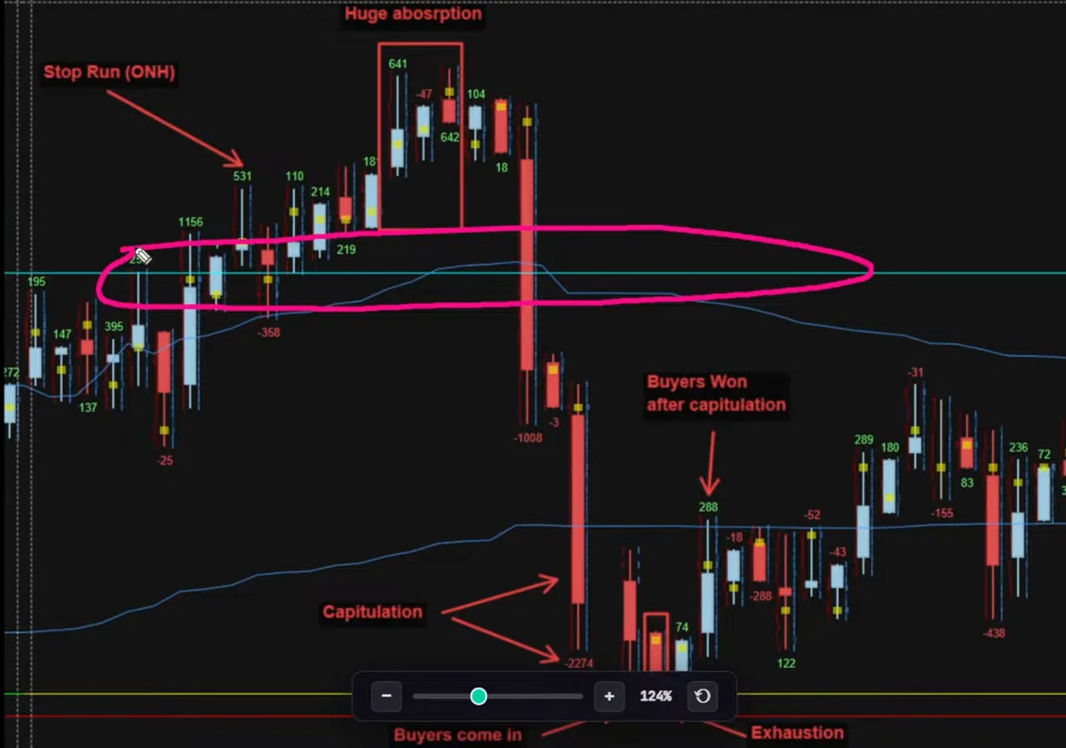
Here's a real short from my student portal, where I review my own trades. It's the same one I walk through in the video further down.
Step 1: The level
Order flow is useless without a level. The blue line is the overnight high, a significant daily level. Price ran through it with +1,156 delta, so aggressive buyers were clearly active right at the level. Other levels that give me the best reactions are the prior day's high and low, the overnight high and low, and value area edges from the market profile. In the middle of a range, I don't read the footprint at all.
Step 2: Absorption, the fight
Inside the box, one bar printed +641. 641 more contracts bought at market than sold, and price rejected instead of going up. Those buyers got absorbed by passive sellers.
Then the next bar printed −47 delta and price went up. Sellers came in at market and couldn't push it down either, because passive buyers were catching them. Both sides were absorbing at the same level. That's a fight, and a fight at a level is exactly what I want to see. I go deeper on this pattern in absorption trading.
Step 3: Exhaustion, and the entry
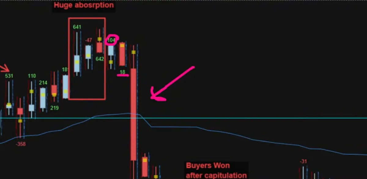
Exhaustion means one side gives up. Buyers pushed one last time with +104 and price went nowhere. They tried again and price kept drifting lower.
Then a big wave of market selling came in, and for the first time in that whole area, price actually moved, which is my entry signal. The buyers gave up, the sellers are in control, and I'm short in that rotation. The exact entry and stop logic is written out in order flow entry signals.
You can see the same thing play out in reverse at the bottom of the chart: strong selling into capitulation, buyers absorbing it, a failed push for a lower low, and then buyers moving price for the first time. The logic works for exits too.
| Absorption | Exhaustion | |
|---|---|---|
| What you see | Big delta, price doesn't move | A last push with less follow-through, then the other side moves price |
| What it means | Passive orders are catching the aggressor | The aggressor has given up |
| What I do | Wait. It's a fight, not a signal yet | Enter when price moves for the first time |
And to be honest about it: this doesn't win every time. Sometimes price moves in your favour, finds fresh buyers lower down and comes back to stop you out, and that's normal. What the footprint gives you is a good entry at a good level with a clear reason to be wrong, and then risk management has to do the rest.
My Footprint Chart Setup
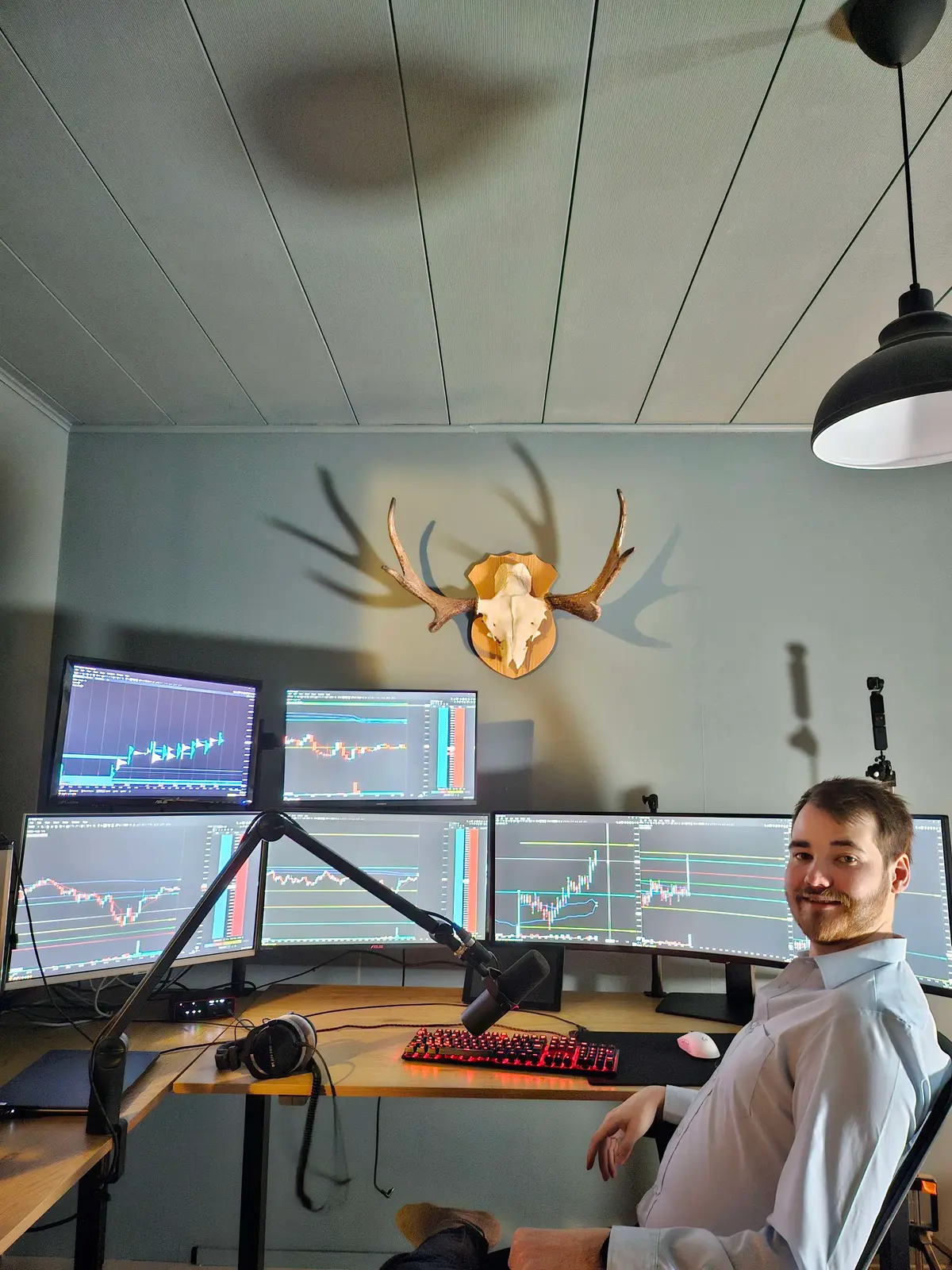
People ask for my setup every week, so I recorded the whole build. It costs under $100 a month in total.
The short version, if you'd rather read it:
- Platform
- MotiveWave, Order Flow edition ($49/month when I recorded it)
- Data
- Rithmic level 2 ($42/month with the connection fee)
- Study
- Volume Imprint
- Column type
- Ladder, tick interval 1, imprint count 500
- Ladder
- Everything on except value area color
- Delta
- Show fill and show imbalance on, candle totals for positive and negative delta
- Candles
- "No bars", so the footprint replaces the candlesticks
- Bar type
- Point and figure, box size 1, reversal 10 on ES
Prices change, so check both sites before you sign up. I'm not affiliated with either.
Footprint Mistakes I See Most
- Reading it without a level. Absorption in the middle of a range happens all day and means very little. Mark your levels first, then open the footprint.
- Trading one big number. A huge delta on its own is information, not a signal. I want the fight, and then the exhaustion.
- Using time bars in a fast market. Rotations get chopped up and the footprint turns into noise. Try point and figure, range or tick bars.
- Never adjusting the reversal. A setting that works on a quiet day will print far too many bars on a news day.
- Expecting it to win every trade. It gives you the edge in the moment. It doesn't remove losses.
Footprint Chart FAQ
What is a footprint chart?
A chart that shows the orders traded inside each bar, price by price. On top of open, high, low and close, you see how many contracts traded at each price and whether aggressive buyers or sellers were in control there, usually as delta.
How do you read a footprint chart?
Start at a level. Read the delta to see which side is attacking and how hard, then check whether price actually moved. Big delta with no movement is absorption. A last push that goes nowhere, followed by the other side moving price, is exhaustion and the entry.
What does delta mean on a footprint chart?
Market buys minus market sells, in contracts. Positive delta means buyers were lifting the offer more than sellers were hitting the bid. The bigger the delta, the bigger the force, which is why a big delta that fails to move price matters so much.
What is the POC on a footprint candle?
The price inside the bar where the most volume traded. It shows where the effort went. A close far away from it means the side that put in that effort got pushed back, often an early sign the attacker is running out.
What is the best chart type for footprint trading?
I use point and figure bars with a box size of one and a reversal of about 10 on ES, so each bar is one rotation. Range, tick and volume bars work on the same idea. Raise the reversal when volatility goes up.
What do I need to trade with a footprint chart?
A platform with footprint charts and real level 2 futures data. I use MotiveWave Order Flow edition with Rithmic, which was under $100 a month when I recorded my setup.
Want me to go through your footprint charts with you, trade by trade?
See 1-on-1 MentorshipMore order flow: Order Flow Trading Guide • Absorption Trading • Order Flow Entry Signals • VWAP vs Volume Profile • Market Profile Guide • All Free Resources